
Dont suppose you successfully use text to speech through webcore on any of your Sonos’? I’ve having a hell of a time getting it to be responsive.
Share your Dashboard
MajorEvent
#63
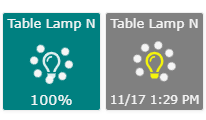
I really liked the idea of the turning on/off indicator but not so much the gauges, just a personal preference. So, I had two choices, I was already using a modified Light Switch Status Tiles example so I could modify that or try to modify your code to deliver standard tiles. For now I went with the former though I like the tightness of your piston so may switch.
Here’s my Light Switch Tiles v0.3 featuring:
- No nullPointerException
- Light bulbs instead of switch icons (you’ll have to make changes if you want switches.)
- On/Off spinner which has a spinning circle and a flashing light bulb.
Nezmo
#64
Yes, I use the Speak Text command and things seems to work well. I’m only doing announcements through one of my Sonos.
fieldsjm
#65
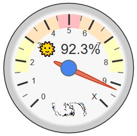
I just started messing with gauges.
@Nezmo
How did you get multiple character for the major tick marks in your temperature gauges? I’m seemingly limited to one character.
EDIT: Never-mind, you didn’t actually label, you just have the min/max labels…duh
Anyone discovered how to add more than a single character to the major tick marks
WCmore
#66
I have only been successful with single characters…
So, for example, if I am drawing a gauge from 0 to 100, I may use 0123456789X
(Where 2 = 20%, and X = 100%)
Note, you can use a period to add a major tick without an alphanumeric character…
(as seen at the far right, after December)
fieldsjm
#67
Thanks, I was afraid of that.
I think I am actually going to leave out the majors for now (which labels min/max nicely). Just seems cleaner to me. For a 0 to 100 scale, I’m using 5 minors so it is fairly easy to read by 5s.
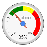
My Ecobee’s Relative Humidity
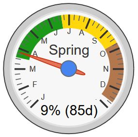
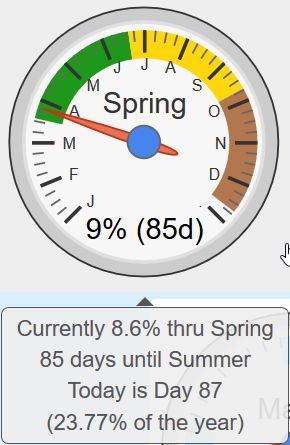
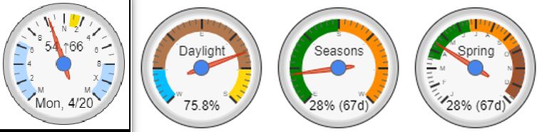
I am intrigued by your seasons gauge. How did you define the seasons, by day of the year? and 9% into spring with 85 days remaining until summer?
WCmore
#68
Originally, yes… Quick and simple, but only accurate within 24 hours…
Since then, I have “beefed” up the logic a bit… Now, it pulls a local JSON, which has the precise time of when the seasons change. (for my location)
You can see the nine days that straddle the recent Equinox in this post.
Yup, you guessed it… If I hover my mouse, I get even more details:
rafael.tomelin
#69
Hi,
How can I create graph dashboard in webcore / smartthings?
In my encore, not show graph. My version is 0.3.110.
WCmore
#70
Do you mean gauges like the last few posts, or graphs like this??
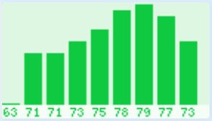
or this:
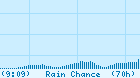
This last one shows the rain chance the next 70 hours, in a 7 day animated image…
(with vertical lines every 24 hours, and horizontal lines at 20%, 50% and 80%)
fieldsjm
#71
I’ve been working on my dashboard for a while, taking from the great ideas in the community. I like the ability to make things as dynamic as possible. Hoping to resurrect the thread and see what everyone else is doing.

WCmore
#72
Looking real good!! Thanks for sharing!
I find it especially rewarding seeing my programming getting some good use…
fieldsjm
#73
I like to think that I know good work when I see it…definitely an inspiration for other pieces.
WCmore
#75
I have one (streamlined) instance displayed on a tablet, and another (hard-core) instance open in a permanent tab on a PC… (AKA: Mission Control)
fieldsjm
#76
The dashboard I shared above is meant to be an overview for me, once it is finished, I might consider creating a tablet version. The nice thing about webcore is that with some creativity, you do do whatever you want with it 