Visual Countdown to a Special Event


#1

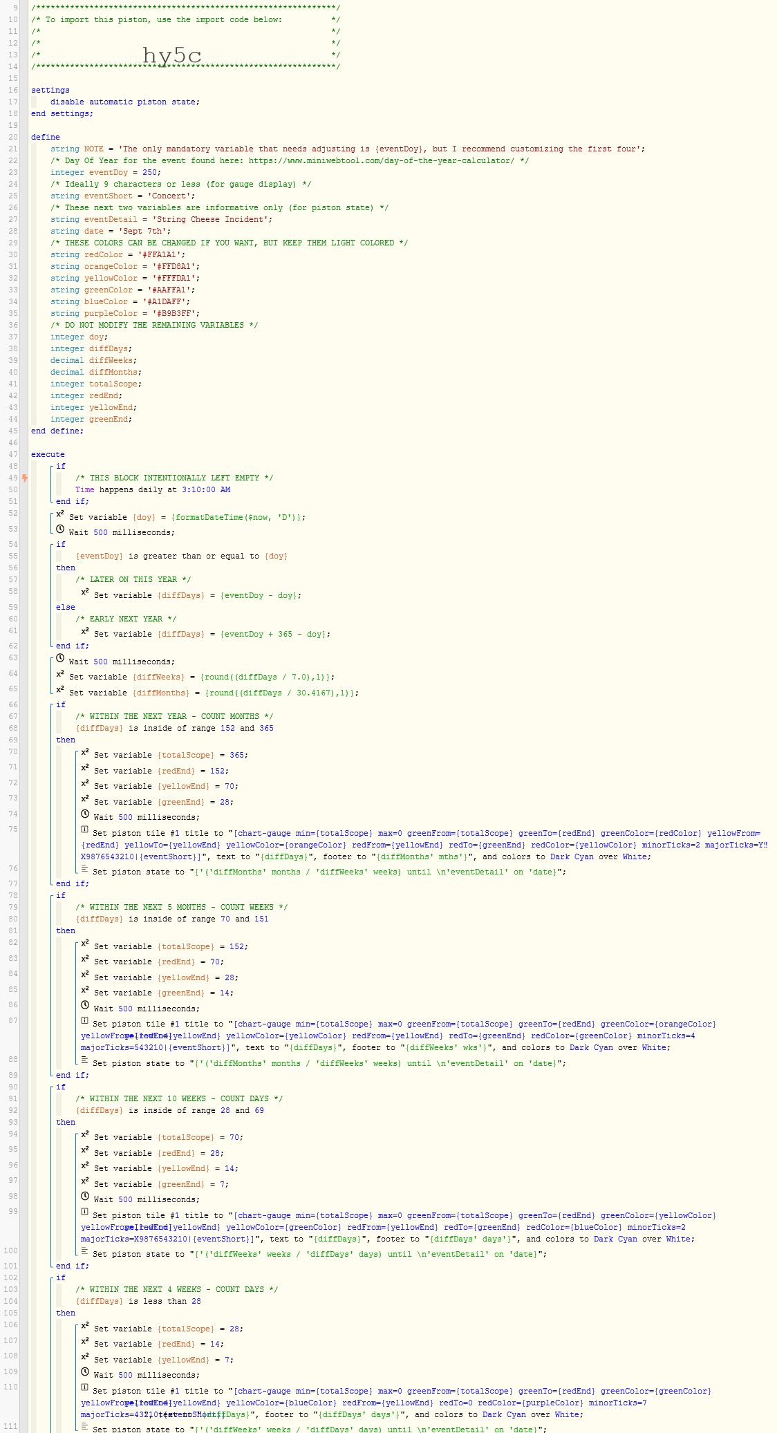
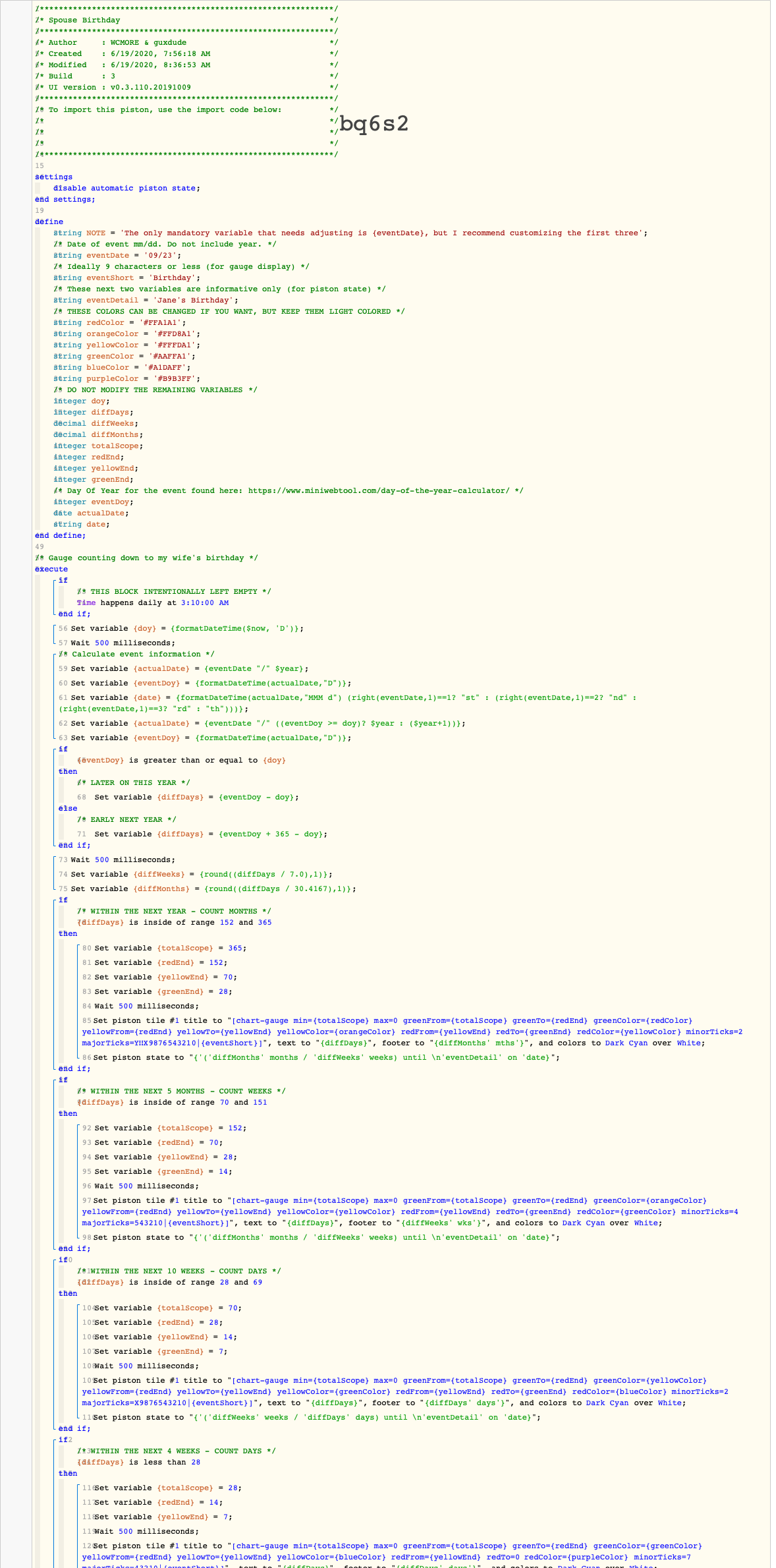
I have been working on creating a visual countdown for our dashboards that counts down to any event within the next 365 days. (holidays, birthdays, anniversaries, concerts, family vacation etc) I decided to use ‘Gauges’ since those dials give a great bird’s eye view of the projected timeline.

One challenge I encountered is that I wanted this piston to cover events in the near future as well as events many months away. With a little fancy coding, the piston below automatically scales itself based on the time remaining. (red & orange is for events very far in the future all the way to blue & purple for events that are happening in the near future)

For example:


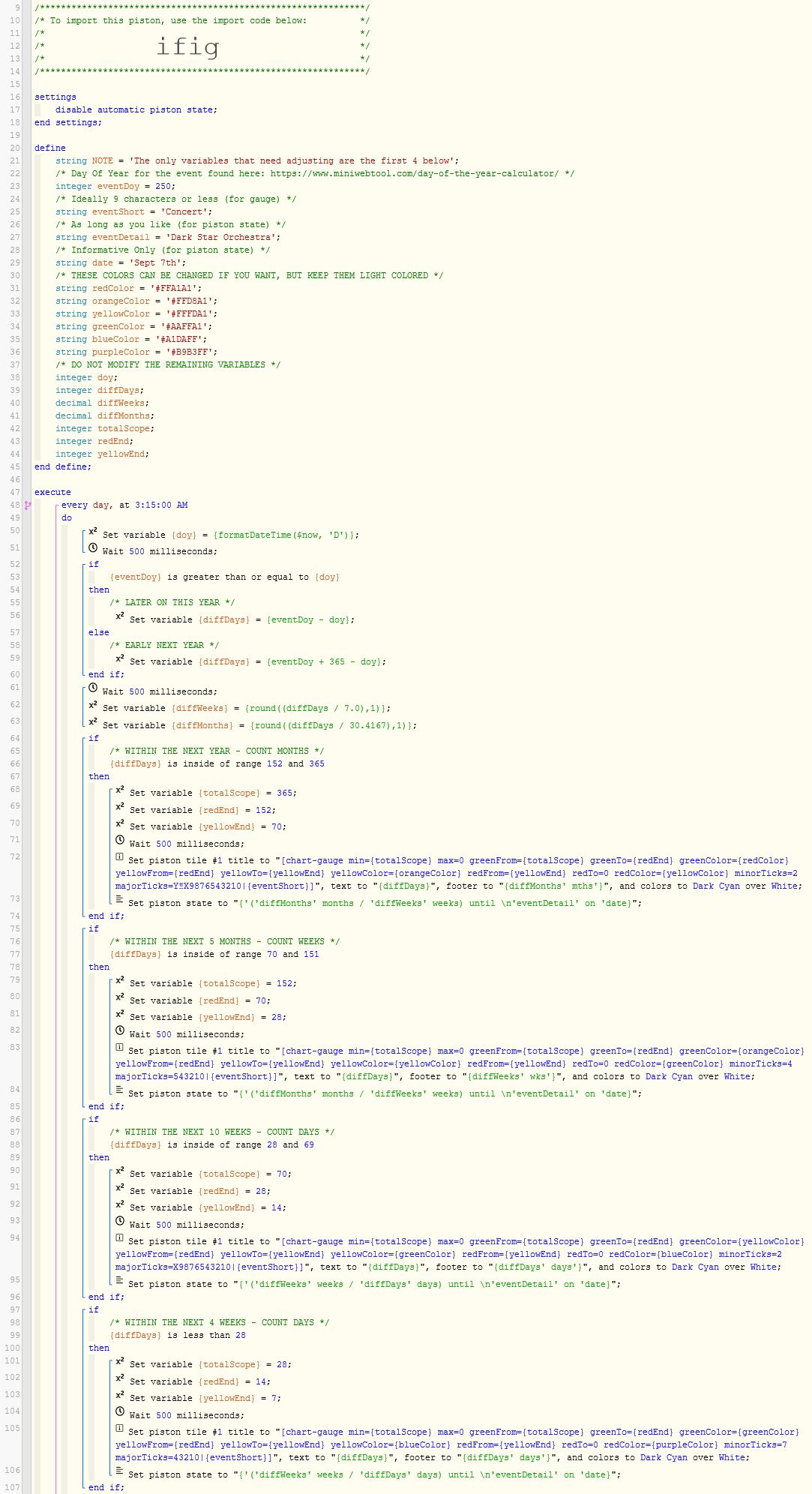
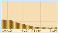
Here is a gauge showing an event nearly a year away:
CD-1
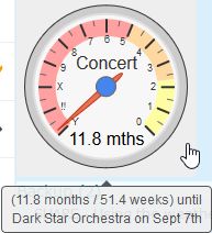
(the gauge & numbers display months, and the tic marks are about 15 days)


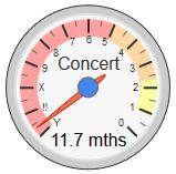
At the 5 month mark, the gauge auto-adjusts, the red drops off, and the orange shifts over & expands:
CD-2
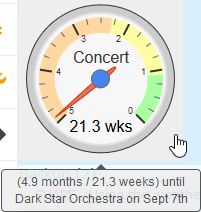
(the numbers still display months, but the gauge & tic marks now represent weeks)


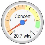
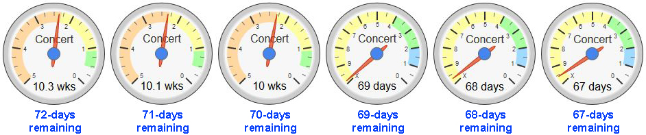
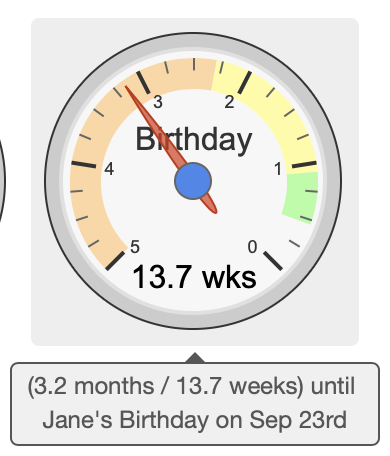
At the 10 week mark, the gauge auto-adjusts, the orange drops off, and the yellow shifts over & expands:
CD-3
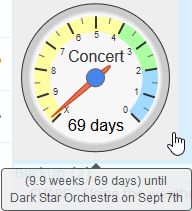
(the numbers on the dial now represent weeks, and the gauge shows the days)


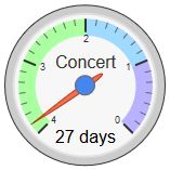
For the last 4 weeks, it adjusts again, the yellow drops off, and the green shifts over & expands:
CD-4
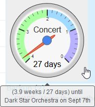
(the numbers still represent the weeks, but the tic marks are now the days)


Disclaimer:
I had to fake the {eventDayOfYear} to get all of the above screenshots
(which is why the 2nd line in the hover text looks incorrect)
You will not have this issue when using real data.


Despite all the auto-adjusting, the first and second color are static, and always represents the same time period.

Purple =   0-  7 days
Blue   =   7- 14 days
Green  =  14- 28 days
Yellow =  28- 70 days
Orange =  70-152 days
Red    = 152-365 days

The third color (far right) combines all the remaining time, so that color is not static.


The beauty of this piston is you only need to update one variable to make it work for your event! (whatever day of the year the event lands on) All the calibration happens automatically thereafter.

If you like the examples above, here is the piston…


Side Note:
I set mine to run at 3:15am, but anytime after 12:01am should work

I hope you all enjoy this… It took me a good while to get the numbers & colors perfected.


Daily countdown of days to event that will display on ActionTiles
Locking front door piston will not work
Gauge tiles not showing correctly
#2

I just made a slight modification to the original piston.

We are limited to only 3 colors in a gauge, so I added a bit of white space on the far right to represent the other colors not shown yet. This extra code makes sure that each color always represents the exact same time period:

Red    = 152-365 days   (5 months - 1 year)
Orange =  70-152 days   (10 weeks - 5 months)
Yellow =  28- 70 days   (4-10 weeks)
Green  =  14- 28 days   (2-4 weeks)
Blue   =   7- 14 days   (1-2 weeks 
Purple =   0-  7 days   (1 week or less)

Sample outputs as the time approaches:

CD-1-Red . CD-2-Orange . CD-3-Yellow . CD-4-Green


I also changed the line:
Every day at X
to
IF Time happens daily at X

With this new piston, it still runs on a daily schedule, but you can also press TEST to force it to run anytime you like.

Here is the new (and improved) piston.


#3

This is awesome!! Your pistons blow me away.


#4

I think you just have one type for eventDay. It says eventdoy :smiley:


#5

The variable {eventDoy} is an abbreviation for EventDayOfYear.
It should be a number from 1-365


#6

Doh! Silly me. Sorry.


#7

No problem. I have a tendency to abbreviate my variables to try to conserve space a bit, LOL


#8

I just wanted to show a real life example of a countdown I have running at the moment…
(pics taken 24 hours apart)

Notice, whenever the needle enters a new color, the entire gauge will re-scale itself.
(with the needle always moving to the right)


The observant ones might notice a slightly bigger “step” in the yellow as compared to the orange. (about 2.5 times larger) This is intentional, and is a trend that continues each time the gauge scales itself.
(IE: it gets more precise the closer we get to the event)


#9

Interesting!
Are there other display choices besides‘Gauges’, like ‘Clocks’ ? Not necessarily for this piston, but in general.


#10

WebCoRE cannot draw a design without help from a third party app.
(Google draws the gauges seen above)

You can use webCoRE to make a three line tile with quite a bit of data squeezed in…

temp

or if you find an online clock, you can embed the jpeg in a tile as well…

Just keep in mind that it only updates when the piston runs, so a clock will never be 100% accurate.


For some of the fancier images, I use PHP to draw the image…
Here is an example of my favorite river depths over the previous 47 days:

temp
(Depth captured each day at midnight)


#11

I almost forgot… here is a thread that I created for just that purpose…

It is not your traditional clock exactly, but surprisingly accurate.


#12

Let me rephrase the question. In this example, there are lines with "Set piston tile #1 to “[chart-gauge…”. Is there another chart type available in Webcore, such as "Set piston tile #1 to "[chart-???..


#13

Google offers 20+ charts, but I have not tested yet to confirm if they work in webCoRE…


#14

I love this! Hadn’t seen it until you mentioned it the other day. Of course, I had to make a tweak. If interested, this version just takes the date in mm/dd format and does the rest of the calculations. The only benefit really (other than not having to look up the DOY) is that, as it repeats every year, it will automatically adjust for leap years. Not a big deal but here for the fun of it.

56%20AM

(No, this is not my wife’s actual birthday or even her actual name. Just an example :slightly_smiling_face:)