Barometer/Anemometer Gauges

tiles
weather

#1

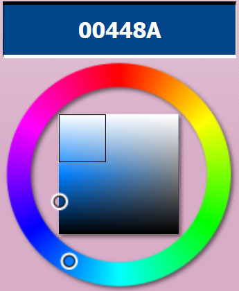
Just for fun, I put together a piston that draws two gauges. One is a representation of a Aneroid Barometer and the other is a simple Anemometer displaying wind direction and speed.

image

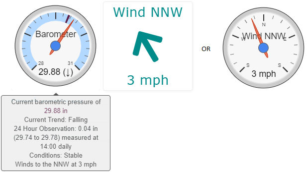
All data is pulled from available $twcweather data so accuracy will be dependent on your location relative to the weather station.

Most physical aneroid barometers will have a second needle, which serves as a reference point to compare pressure across two time points, typically 24 hours apart. Unfortunately, we are limited to only one needle so a reference range is drawn into the background color of the gauge to represent a 2nd needle.

In the above screenshot, the range is very small and relatively similar to current pressure so it is hard to see. (Which means I should not be experiencing any changes in weather patterns :heavy_check_mark:). If you’re interested in the background of barometeres, this is a neat website https://www.artofmanliness.com/articles/fair-or-foul-how-to-use-a-barometer/.

Piston Implementation:
Required Settings

  • $twcweather barometric pressures will be reported in either inches or millibars (as far as we know) depending on location. The gauge can handle either but needs to be calibrated. Set the inVSmbars boolean to true for inches or false for millibars. (To determine what data you receive, use the evaluation console to pull the following expression: $twcweather.conditions.pressureAltimeter ; result will be either in the range of 28-31 [inches] or 950-1050 [millibars]).
  • compHours is the time in which you want to use for your comparison (in 24 Hour). Ex. 14 = comparing data daily at 2:00pm
  • Due to the built in reference range, piston must execute the 24 hour timer twice to save the data for your location. In the meantime, you may see errors/unusual colorings on the gauge.
  • Wind Gauge: set wGvsT bolean; True = Gauge, False = Tile
  • Hitting test will draw the initial gauges without the reference data (which is updated every 10 minutes). Once the gauges are drawn, you can click either of them to refresh the current data.

Update: 7/12 - Editing colors with a lighter background for readability based on @WCmore’s suggestion in post #4.
Update 7/13 - Adjusting wind gauge to capture full spectrum of values; Added an option for a simpler tile format. See post #5


#2

This is looking real good, @fieldsjm:+1:

Would you be interested in feedback or ideas for “improving” it a bit?


#3

Feedback is always appreciated.


#4

Three things jump right out at me… Two of which could go in the “master” piston, if you are interested, but the third one can only be done by the individual home user.


(1) I realize this piston is only on “day 3”, so this one you would likely have updated anyway without me saying a word, but here it is. The dark blue is way too dark. You can still use that color of blue if you like, but perhaps try a more pastel version of it?

For good background shades, I might recommend typing in 00448A here, and then choosing a shade from the upper left area.

pic

Note: You don’t have to start with 00448A… I just based that on your original color. The real emphasis is to select a shade from the top left section, shown highlighted above. This will allow users to actually see the tick marks beneath.

(Note: webCoRE will require adding a hashtag to the front)


(2) This one is also cosmetic, and refers to the compass. I like what you did here, although I suspect, like me, you will get frustrated with missing out on 25% of all data. (315-360 and 0-45)

My recommendation for this is to:

  • Make your min/max become 0/360…
  • Set 5 majorTicks (SWNES)… (the 4 cardinal directions, with two S’s)
  • Set minorTicks at either 2 (for SW) or 4 (for SSW)

Yes, I realize that the gauge will display North to East 68° apart instead of 90°, and if we were using this gauge in the field, (parallel to the Earth) I would probably leave the 90° as it is. But seeing how our devices do not lay flat, my opinion is, it will be more useful to display all 360°.

I assure you, it will not take your eyes long to adjust.


(3) This one can only be done by home users, and is what I have done in my own Barometer displays.

In the piston above, @fieldsjm was smart to give a wide range. (28-31 or 948-1050) This gives the most acceptability for users across the globe.

What I would like to encourage you, the end users, is to take a few extra minutes, and determine the record low and high barometric readings for your location. If you insert those two numbers on lines 35 & 36, and change the variable types there to decimals, then your gauge will be calibrated specifically to your house.

The end results means your dial will be much more precise, with less wasted space on the two extremes.

An added benefit is, you’ll be able to tell at a glance how today’s pressure compares to your extremes. (mine typically swings between 35% and 65%, so whenever it passes those numbers, the weather is always interesting)

I will post a link if I remember where I found the record data for my location.
(it has been awhile, but my guess would be I grabbed it from WUnderground)


#5

Interesting Ideas

LOL, I had second thoughts from Day 1. The initial idea was to give a dark contrast so that the reference range would be ‘highlighted’. Unfortunately, it completely wipes out the ticks marks. I’ve updated the original post with a lighter background and darker reference colors to achieve the same effect.

If my theory holds hold, we might not completely miss out on that data. In designing it this way, I was counting on the idea that the gauge needles will actually surpass the min/max levels. For example, I am currently reading SE winds, degree value of 320. The needle has dropped slightly beyond the 315 max. However, I have not seen a true S wind to verify it would go straight down. If so, the data is still represented just not within the confines of the pre-segmented gauge.

However, I am interested in how your idea, primarily in terms of how it would affect my perception of the compass. The 90° separation between cardinal directions is so ingrained in my consciousness it might be difficult to break that construct. I am adding a third gauge to my personal piston to visualize the concept long-term (not included in the import).

For anyone else who would like to see this in action, update the Title expression in lines 73 and 83 to:
'[chart-gauge min=0 max=360 minorTicks=4 majorTicks=SWNES|Wind {dir}]'

I would encourage users to do the same and to continue to personalize, share unique ideas, and maybe catch something I didn’t.


#6

A “double negative” is definitely a positive! :sunglasses:


The colors can be manipulated to go “below zero”, but I have not found a way to trick the needle into going past the invisible ‘bumpers’ yet. (approx -2 & 102 on a 0-100 dial)

All that said, I am still rooting for you!
(I’d recommend using a one line piston if you want to test that out)


I have encountered this “animal” in many of my previous gauges…
For example, here is my webCoRE “clock”… (currently showing 6:28 PM)

pic

One second after midnight, the needle begins at the “lowest” position (bottom left). At mid-day, it points upwards… and one second before midnight, the needle finally points to the final bottom right extreme.

It takes a few days for the mind to go from thinking “cylindrically” to a beginning-middle-end cycle… but the mind adapts quite well, and surprisingly swift. (I estimate it will not seem so strange after the third day)

For reference, when it comes to gauges, I do this with many types of “circles”, not just the Sun or cardinal directions.

It works for astronomical cycles such as the Moon’s, but also routine cycles like changing the oil in my car or changing the cat litter box… and even consistent cycles such as years, seasons, months, weeks, or days. All of these have a beginning-middle-end which immediately starts the next cycle.
(similar to the compass going from 358, 359, (360 / 0), 1, 2)

I guess what I am trying to find the words to say is, your eyes will quickly see the dial, and be able to instantly see where you are between any two landmarks on the gauge.
(even if the 90° is squeezed a bit to 68°, due to the limitations of the gauge)

On your compass, North will still be straight up, and East / West will be mostly where expected.
The only ‘real’ challenge will be the South. But here is how I look at it, using made up abbreviations:

  • SSE = Low bottom right
  • SSSE = Lower bottom right
  • SSSSE = Lowest bottom right
    .
  • SSW = Low bottom left
  • SSSW = Lower bottom left
  • SSSSW = Lowest bottom left

TL;DR

In the long run, I think we will be disappointed if any dial does not show the full range.


#7

Attempted various manipulations and got the same result as you mentioned. The needle will drop slightly below the min/max but no further. I have adjusted the gauge in the piston as you suggested.

As I was doing so, another thought crossed my mind. I added a tile option, that uses a FA arrow with rotation. It is true to direction but not specifically calibrated on a coordinate system (there are no tick marks representing specific values). The piston will draw either based on the select of the wGvsT boolean variable.

image


#8

Your gauges are looking real good now.

Great idea for a tile! I did not suggest that earlier because I am not sure if FA can be drawn in a gauge… (they work great in a tile though)


For the true weather aficionado, it can also be very handy to write the pressureAltimeter to a Fuel Stream. It takes two clicks to view, and it only keeps the previous 7 days worth of data, but it gives a quick glance of what the trend really is, how extreme it is, and where we currently are within that range.

Sample 2.5 days:

The pic above was written once every 30 minutes, with the smallest step being 0.01 inches.
(Edit: Updated pic to show TWC instead of WUnderground)


#9

That same data gets really interesting when you combine pressure (blue) with rain events (red)

pic

Yes, these are real life examples of “5 o’clock showers”. :open_umbrella:

(Updated pic to align with previous post)