Dashboard Request - Edit button placement


#1

Request: Move the Edit,Trace,red& green buttons, etc to the top of the page instead of below the piston. Constantly scrolling down just to get to them. Stated from the point of view of a very bad coder, yet one who is willing to play with trial and error! :slight_smile:

I suppose, once in EDIT mode, you do have the Cancel/Save buttons in the top header/frame - you could do that on the previous page (or at least above the script box).

Thanks for considering.


#2

Agree. First thing I noticed that I would change when I started upgrading my Core poisons to Webcore.


#3

+1 vote on this from me


#4

@danabw @kraig109 how would this work for you?


#5

Looks good!


split this topic #6

A post was split to a new topic: White space between cancel/save button


#7

Yup…that’s good. :slight_smile:

Do we need to keep the large “Script” header on its own line? Uses up more vertical space that way.

Can we put “Script” in-line w/the buttons, e.g.,

Script Edit>> Test etc…


#8

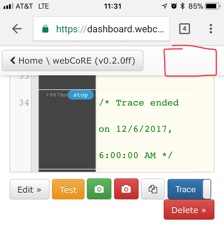
I wonder if it’s useful to have the buttons below the code as well for big pistons… what do you folks think? On mobile sometimes I have to scroll for quite awhile to get down to these buttons, but if I’m testing a piston on mobile and looking at the logs that means I would have to scroll down to the console anyway.

If the buttons are only at the top then testing in this way can be much more painful on mobile. For every run I would need to go to the top of the page to click Test then scroll all the way back to the console to see the results, rinse and repeat.

What if the toolbar were fixed to the top of the screen while scrolling over the code then dropped back below the code when you reach the bottom? You might be able to get away with the default affix in bootstrap which would fix to the top of the screen but stay fixed after you scroll past the code rather than snapping back in at the bottom of the code.

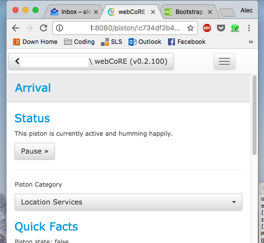
The easier version of that is putting the buttons in the main navigation bar at the top like in the piston editor. Note though that on mobile that gets hidden behind the menu button.

So three options really… duplicate the buttons above and below, pin to the top of the code while you scroll, or move to the navigation menu.


#9

I was definitely thinking of the same situations. I like the idea of having it fixed across the top so long as it doesn’t add to what is already fixed across the top.

Maybe add the hamburger menu with the options here


#10

We could add them to the fixed top, but as you see in your picture, there isn’t a lot of room in the mobile version—we could look at creating it as a hamburger menu potentially.

On mobile sometimes I have to scroll for quite awhile to get down to these buttons, but if I’m testing a piston on mobile and looking at the logs that means I would have to scroll down to the console anyway.

I guess my thoughts on that would be if you have a long piston you’re looking at logs for, you can use the hide-script function, read the log, then unhide it again pretty easily. But I do see the convenience of having buttons available both at the bottom and the top!


#11

Yea I definitely didn’t want to waste more real estate to these buttons always showing. I am for the hamburger menu


#12

Very good points…having access to the buttons in multiple contexts would be better than a single location.

I think the two most common use-cases for me are:

  1. Access a piston intending to edit it, where buttons at the top are best
  2. Run piston and refer to logs for info and then go back into editing mode to try and fix whatever issue I’m finding in the logs - buttons at the bottom is a must.

I’m fine with the options discussed here, and agree w/the priority that we try to do this as efficiently as possible within the UI.


#13

You got it. 51 PM