@milhouse, nice dashboard. Question on the cameras of course. The tiles are great, but small - naturally. I was hoping to be able to then click on the tile and have it launch the hosted image in a new browser tab - and assumedly full screen. Any idea how that can be done?
Share your Dashboard
milhouse
#53
@kraig109 I wish. I can’t seem to get them any larger on the dashboard - I seem to be limited to a dashboard tile size of tile, medium, or large. This is the large. Not an expert by any means, and I’d love to have them larger. About twice the size would be perfect. For reference, the presence tiles (right above the camera) are regular tiles, and the thermostat tiles (right below the camera) are medium tile.
And, since I am far from an expert, the best answer I have found to get a larger view is right click (or long press) and open in new tab. This does open them full size (and technically they are full size images on the dashboard but scaled down - which makes for a slower load of the dashbaord).
Milhouse
kraig109
#54
right click, open. that works. would be nice if we could code on click open… but maybe somebody will know! cheers. :)
andyhawks
#55
this is so rad, ty sir! I have been trying to figure out how to get static images from my ring doorbell cam onto the dashboard and didn’t know there was a ring api, duh! so I’m going to play around with this and see if I can get it to work with the doorbell cam since it looks like the api was designed for the doorbell. thanks for the code and the lead in the right direction!
milhouse
#56
Happy to help. Make sure you look at the link in the comment at the bottom of the code. That’s the python ring module linkg. Covers the documentation for using the python module, and links back to a similar PHP project, and the original research to reverse engineer.
And it definitely should work for doorbells, too.
doorbell = myring.stickup_cams[0] ----> doorbell = myring.doorbells[0]
There is no real public API - then they couldn’t get your $3/month/camera!
michicago
#57
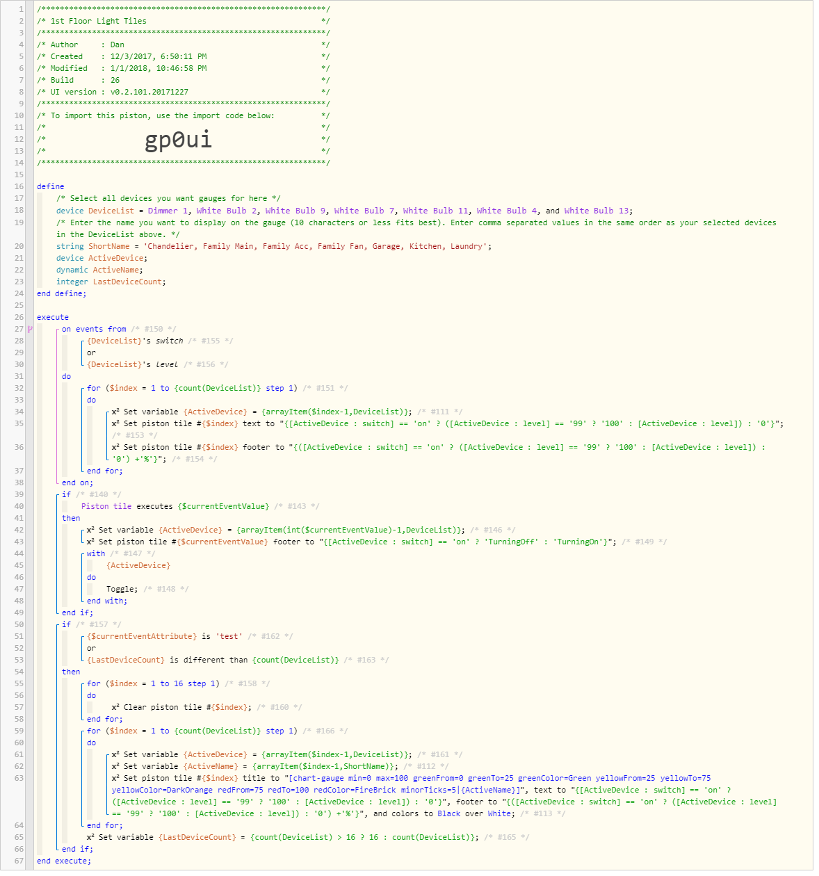
Here’s a minor tweak to the gauges I posted before:
- Modified so gauges are not redrawn on each event (just the text and footer are updated, no graphics)
- Piston is aware if the number of devices has changed and will clear all tiles and redraw them to add/remove gauges.
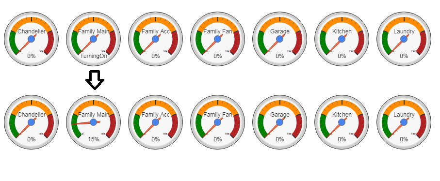
- Added a feature that shows “TurningOn” or “TurningOff” when a gauge is clicked to toggle a light. With some DTH’s having a long shut-off time, this is helpful to avoid getting the impression you need to click it again, turning the light back on/off.
- Made it so 99% shows 100% on the gauge… something about my new dimmers capping at 99% bothered me and I wanted to see they were fully turned on.
I also ditched the background color for a cleaner look - this is easy to add back in if somebody likes the colored square behind the gauge.
Garage Door Status Tiles v0.3

MajorEvent
#61
Wow, It’s great to see other peoples creations. It’s really given me a lot of ideas so thanks for posting your setups!
I’m only just getting started with SmartThings and even newer to webCoRE so my setup is fairly modest. SmartThings is meh, but WebCoRE is great (but the dashboard is a bit basic). I set up two instances, one with smaller tiles for the phones and one with all size tiles for Tablet
Phone version (as seen on the desktop):
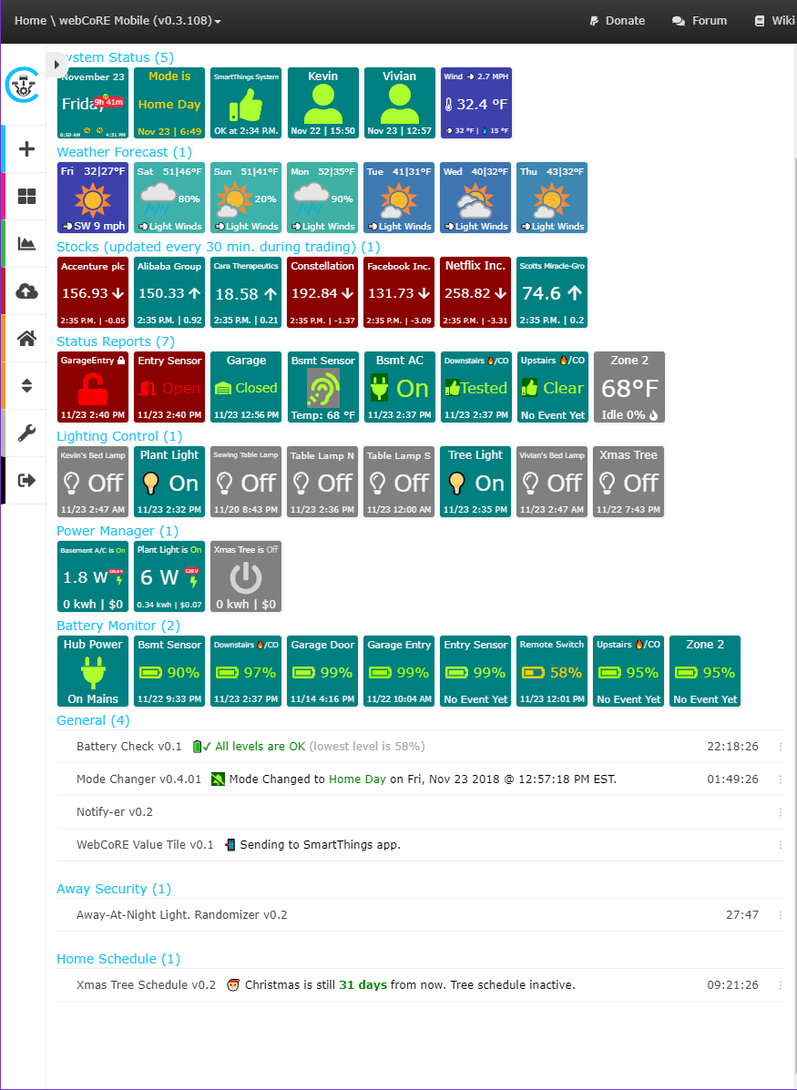
Tablet version (as seen on the desktop):
Edits: typo, add tablet version, update images showing differing states for some tiles, update to latest dashboards
Tasmin
#62
Dont suppose you successfully use text to speech through webcore on any of your Sonos’? I’ve having a hell of a time getting it to be responsive.
MajorEvent
#63
I really liked the idea of the turning on/off indicator but not so much the gauges, just a personal preference. So, I had two choices, I was already using a modified Light Switch Status Tiles example so I could modify that or try to modify your code to deliver standard tiles. For now I went with the former though I like the tightness of your piston so may switch.
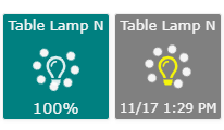
Here’s my Light Switch Tiles v0.3 featuring:
- No nullPointerException
- Light bulbs instead of switch icons (you’ll have to make changes if you want switches.)
- On/Off spinner which has a spinning circle and a flashing light bulb.
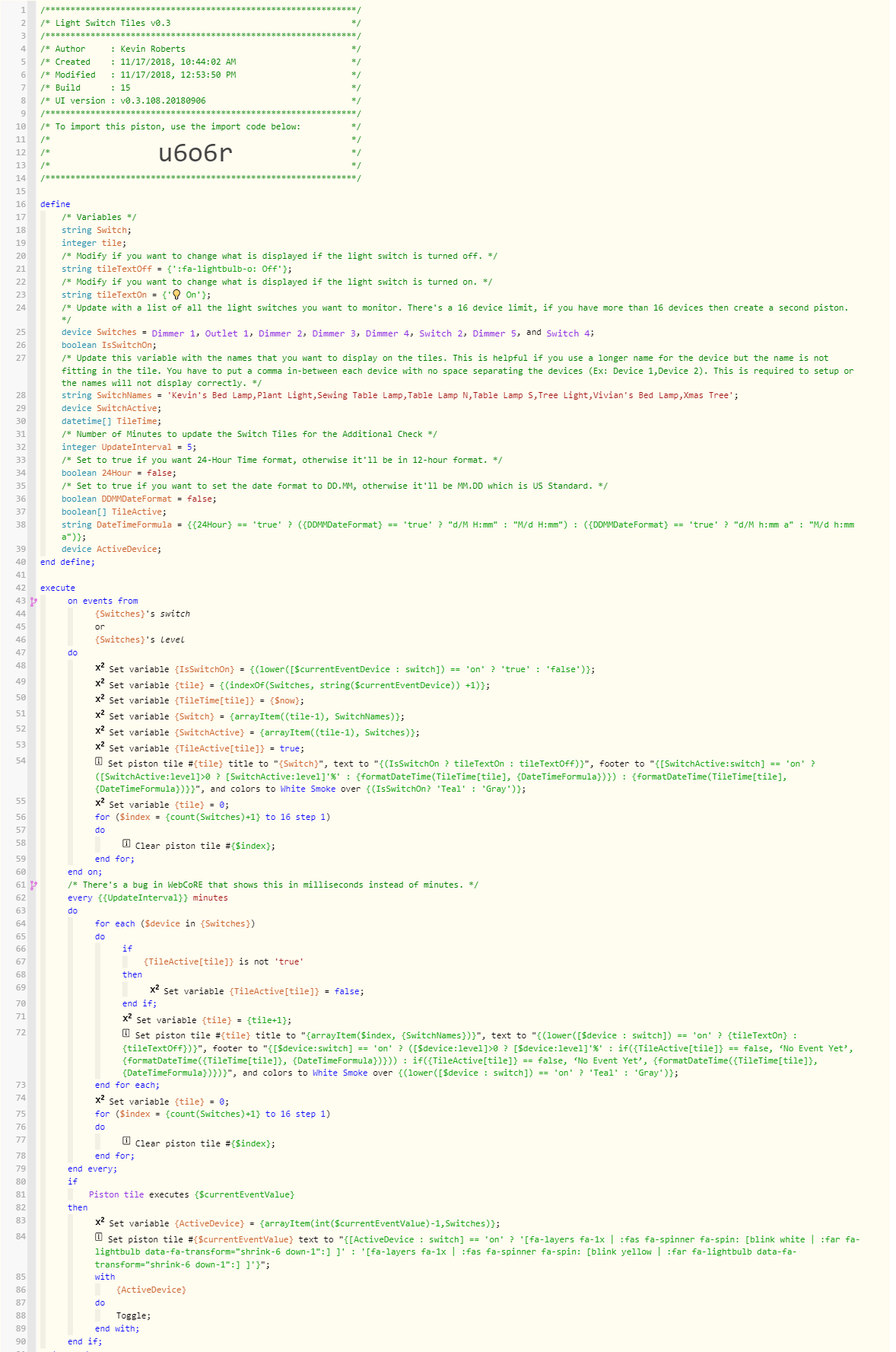
Nezmo
#64
Yes, I use the Speak Text command and things seems to work well. I’m only doing announcements through one of my Sonos.
fieldsjm
#65
I just started messing with gauges.
@Nezmo
How did you get multiple character for the major tick marks in your temperature gauges? I’m seemingly limited to one character.
EDIT: Never-mind, you didn’t actually label, you just have the min/max labels…duh
Anyone discovered how to add more than a single character to the major tick marks
WCmore
#66
I have only been successful with single characters…
So, for example, if I am drawing a gauge from 0 to 100, I may use 0123456789X
(Where 2 = 20%, and X = 100%)
Note, you can use a period to add a major tick without an alphanumeric character…
(as seen at the far right, after December)
fieldsjm
#67
Thanks, I was afraid of that.
I think I am actually going to leave out the majors for now (which labels min/max nicely). Just seems cleaner to me. For a 0 to 100 scale, I’m using 5 minors so it is fairly easy to read by 5s.
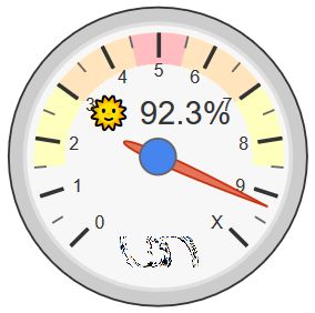
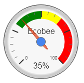
My Ecobee’s Relative Humidity
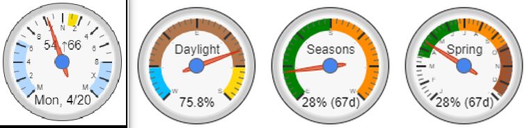
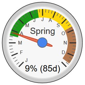
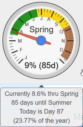
I am intrigued by your seasons gauge. How did you define the seasons, by day of the year? and 9% into spring with 85 days remaining until summer?
WCmore
#68
Originally, yes… Quick and simple, but only accurate within 24 hours…
Since then, I have “beefed” up the logic a bit… Now, it pulls a local JSON, which has the precise time of when the seasons change. (for my location)
You can see the nine days that straddle the recent Equinox in this post.
Yup, you guessed it… If I hover my mouse, I get even more details:
rafael.tomelin
#69
Hi,
How can I create graph dashboard in webcore / smartthings?
In my encore, not show graph. My version is 0.3.110.
WCmore
#70
Do you mean gauges like the last few posts, or graphs like this??
or this:
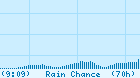
This last one shows the rain chance the next 70 hours, in a 7 day animated image…
(with vertical lines every 24 hours, and horizontal lines at 20%, 50% and 80%)
fieldsjm
#71
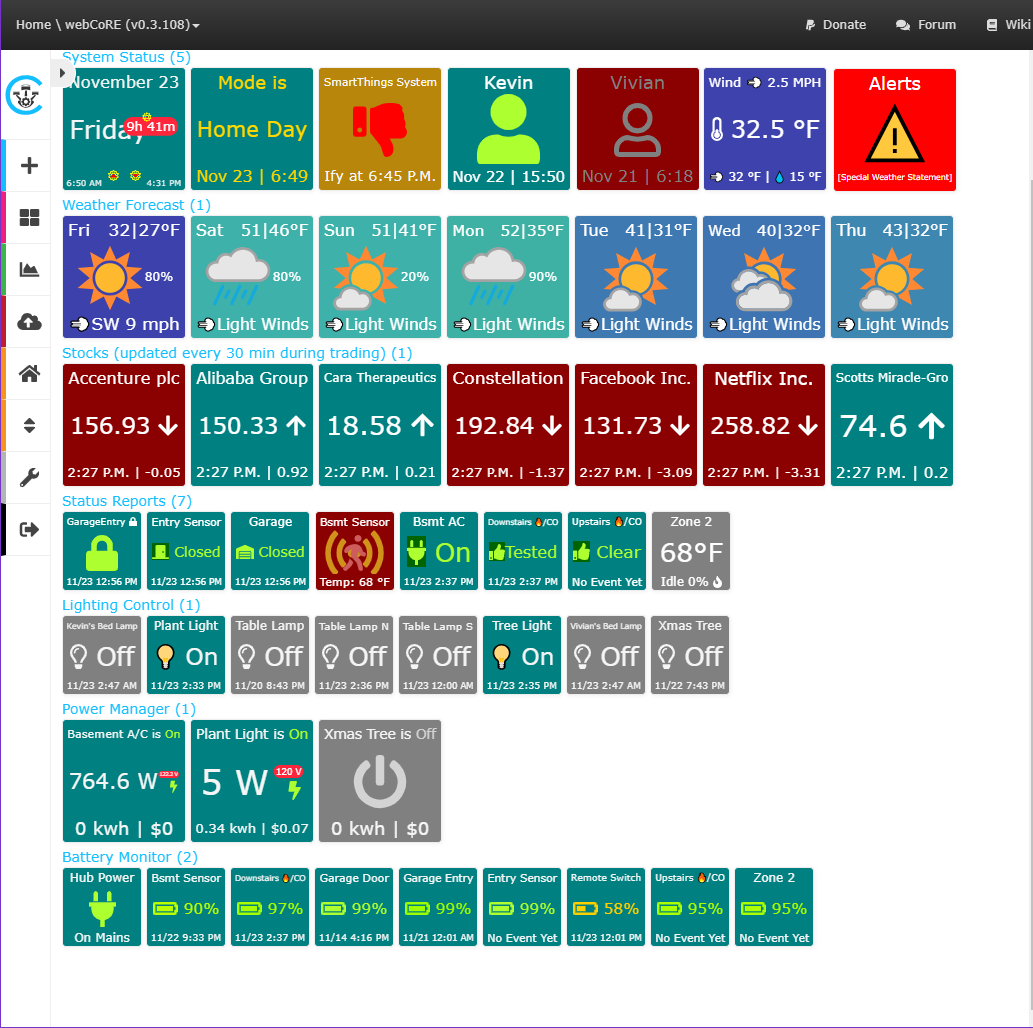
I’ve been working on my dashboard for a while, taking from the great ideas in the community. I like the ability to make things as dynamic as possible. Hoping to resurrect the thread and see what everyone else is doing.

WCmore
#72
Looking real good!! Thanks for sharing!
I find it especially rewarding seeing my programming getting some good use…