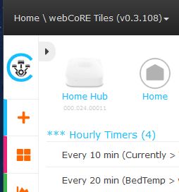
It might be nice to be able to hide or show the category titles on the dashboard (to better present the tiles on a cell phone especially).
Show/Hide Category Titles in Dashboard
A workaround that I use in the meantime is:
I keep my tiles in 1 or 2 categories, and sort them by adding numbers or letters in front of the name. This way, the tiles have nearly no gaps between them when viewing on a small device.
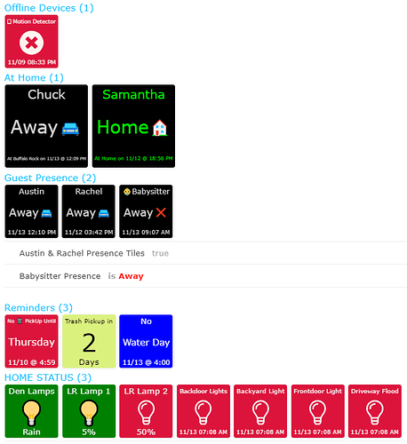
Those are both great ideas that I also currently use. The ability to show/hide the title bar might be an easy (compared to some requests) switch to add was my thinking. tw1st3d7550 images gives me a good illustration. The ‘Austin & Rachel Presence Tiles true’ could be hidden because the category it’s in could be set to Tiles (only). The hidden title category could then be set for details and contain the Babysitter presence giving a seamless appearance and hiding the un-necessary piston information.
If I’m asking for the moon, I’d ask for mixed tile sizes in a category and some other formatting options for the Dashboard too. (like I’d die for centering instead of left!) 
I am not sure if there is a cell phone equivalent, but on my desktop, I use a browser extension like Stylish or uBlock Origin to hide (or resize) certain elements on my Dashboard.
(It does require a basic understanding of CSS, but it’s only one line of code per element)
Normal Dashboard versus my custom:


This lets me see about twice as much information on the same page.
Thanks for the suggestions but that’s getting to be a lot like work if you know what I mean.  WebCoRE is already pretty good; the rules engine is great but the dashboard is still a bit basic. Currently I have two instances, one for tablets that uses Large, medium and small size size tiles for better visibility from a distance and the other instance for the cell phones that only uses the standard tiles. One instance is only for displaying tiles and information and the other handles schedules and notifications and mode changes and other automation tasks to avoid duplication.
I admit, it was a bit of a pain to find the right element in Stylish, but I have not needed to edit or tweak it since I created it over 8 months ago… So there is that.
Sample code in uBlock Origins:
![]()
Sample code in Stylish:
![]()
For me:
- uBlock is easiest to remove elements. (simple right click)
- Stylish is best at changing elements. (requires CSS knowledge)

