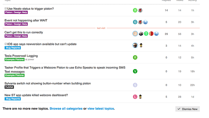
Yeah we see it, too. Missing buttons, messed up logos, etc. A Discourse update seems to have crippled our custom theme a bit but it will be back to normal later this week.
What happened to the forum layout?
Hm maybe nobody noticed 
The forums are close enough to normal for the evening, please let me know if you notice anything that is still broken!
it changed though right???
When I click on LATEST it gives me a different layout than before…
I have been experiencing this issue
But it seems resolved this morning but now the layout is changed. Layout change is fine but it was hard to follow discussions without avatars. Just easier to recognize avatars instead of names. 
Thanks, it looks like that kind of went away because for some reason the Latest tab links to /latest rather than / (i.e. home page). It’s still on the home page community.webCoRE.co which also still shows Latest.
Ugh, the layout of the “new” page almost hurts my eyes. It was much cleaner and more compact before.
I don’t know if voting would bring it back…
But I’ll leave mine here +1
#wewanttheoldstyleback
What does this mean? We’re not going to revert to an older version of Discourse, but can you show specific examples of what has changed?
I was jus talking about this part,
I can’t remember how it was but it was different??? (or was I too drunk the last year LOL 


 )
)
I don’t remember what it used to look like but I’m glad to see it’s not broken. Can anyone find another Discourse site that still has the preferable old styling for new/latest?
I’ll have to look. I just know it was more compact, and therefore easier to scan quickly without scrolling.
This new style is much more spread out 
and the user icons are even smaller.

I like ultra compact as well. The more information seen at once, the better
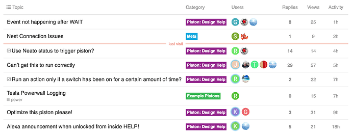
Was the category in its own column rather than below the title? I can reduce the padding and text sizes just hoping to understand what it looked like before.
I think that may have been the main difference, I found a topic on Discourse meta with a theme component that reverts to the previous behavior. How does it look now?


