Footer Text does not shrink to fit Tiles on Firefox


#1

On Firefox, the footer text on the dashboard tiles does not always shrink to fit the tile as it does on other browsers. Tiles often display with an ellipses and missing text, as below. It’s been this way as long as I can remember.

screenshot

screenshot

Reposted as a bug report per request of @ipaterson

Edit: My original post mentioned the header text also, and I seem to remember it happening there as well, but I couldn’t find an example to post.

#2

I can’t replicate this in Firefox 52 or in the latest version on mac or Windows, can you share an example piston with static text?


#3

I don’t know if this is exactly what you wanted, but here is one example. This works when the dates have more digits, as in a two-digit month and/or two-digit day. You’ll have to adjust these as needed based on your local time & zone. I copied the footer expressions from existing pistons, at least one of which was originally borrowed from the community.

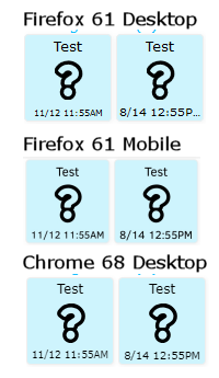
On the images below, you can see that in Firefox 61 for Windows (64-bit) the results are inconsistent. In one instance the footer is almost too small, in the other it overflows the piston. Note that this behavior is NOT present in Firefox Mobile. The footers in both Firefox Mobile and Google Chrome are consistent.

I used dashboard.webcore.co and a clean Firefox profile.

example


#4

I was not able to get that truncation effect, so I’m not sure if disabling the truncation would cause the text to shrink properly or instead cause the text to not shrink and overflow the tile… Please log in to dev.webcore.co and do the same tests with your tiles. I temporarily disabled the truncation to see what happens so at a minimum you should no longer see the … ellipsis.


#5

Interesting. I was easily able to reproduce the effect on a neighbor’s dashboard and PC just last night.

In any event, disabling the truncation made a difference, but it’s not a preferable difference, as shown.

Non-Dev Dashboard
nondev

Dev Dashboard
dev

What’s interesting to me is the difference between the first tile and the second on each one is a single character. In this case, the one on the left actually has one more character than the one on the right.


#6

Following up on my previous post with another test piston (ja9f), wherein I added one character at a time until the footer ‘broke.’

In the first tile, the text does not need to shrink. In the second, it shrinks properly. In the third, it’s broken. In the fourth, the footer shrinks properly again. The difference between tiles 2, 3, and 4 is just one character each.

example

Not sure what this means, but I was curious to try it.


#7

Thanks, I was afraid that removing truncation would be worse… I set a reminder to revisit this in a few weeks.


#8

Still not urgent, but just a reminder.

Screenshot_2018-11-14%20webCoRE%20Dashboard


#9

Since the original approach did not work out I have a second attempt based on the latest version of the ng-FitText component that provides the text sizing. Please try https://dev.webcore.co/

This update seems like it could introduce some overhead, so if you have a large number of tiles please also let me know if the dev dashboard seems any slower (e.g. choppy scrolling, slower to load)


#10

Unfortunately, no change.


#11

Thanks for checking. Unfortunately I don’t think there is anything else I can do here. After the latest test it seems more likely to be a fault with the calculation of the correct text size than a timing issue where the size is calculated but then the text changes. It seems the component that provides this text sizing is no longer maintained by its original author.


#12

:cry: … but not a huge deal anyway. Thanks for looking.