
Spinning squares means you haven’t cleared the cache in the browser… spinning squares are out… funky spinning circle is in.
MAJOR ANNOUNCEMENT: 2000 Community Users & Brand New Dashboard!
Robin
#70
The new UI in the browser will work without updating the smartapps… but you should still update anyway.
How did you do the original install?
GitHub integration or copy/paste?
bobbles
#78
I’m not sure what’s happened but 2 instances seem to have merged.
I have 3 instances.
WebCoRE. For all my pistons.
WebCoRE-Tiles. For all my tiles.
WebCoRE-Presence. For all my presence locations.
I have just gone into the presence instance and deleted one of the locations. Saved it. No problem.
Gone into the piston instance and all my categories have disappeared. When I go into the settings for the piston instance all my locations are now there. They are all still in the presence instance as well.
Blast.
GRClark
#79
Just wondering if there are any benefits for separate instance for presence locations. I’ve got separate ones for tiles and pistons, but locations are in with pistons.
Ryan780
#80
Totally amazing!!! In addition to looking great it seems to respond a LOT faster. Great work!
bobbles
#81
No advantages at all but in the early days of webCoRE presence we had different instances as it could cause issues when deleting the presences.
Not an issue anymore.
With over 100 pistons I now have to allocate them back into categories for easy searching.

EDIT: The 2 instances are now linked somehow. Whatever I do in one seems to appear in the other. I don’t want to delete one in case I lose the other. Time to tread carefully in case I lose everything. 
bthrock
#82
Having played with it for a couple of days, I really like the new dashboard a lot. It is a welcome enhancement to the overall WebCoRE experience.
My only complaint—and, man, I really hate to nitpick on something this well done—is that, for me at least, the font for the category titles is almost invisible on some devices. I quite understand why the color was chosen, but somehow that color and font weight combination doesn’t quite work for my aging eyes. 

GRClark
#83
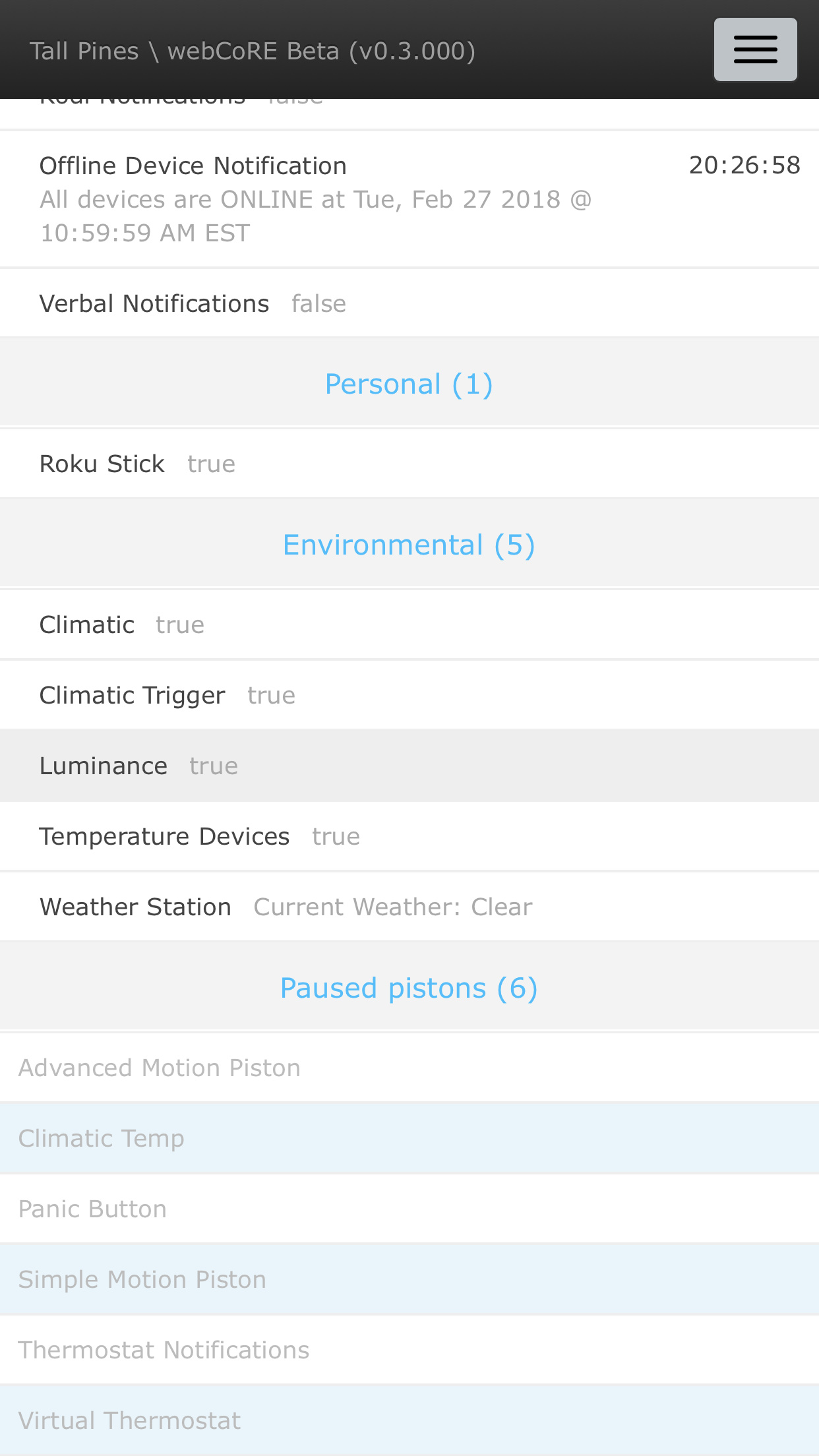
I was wondering why there wasn’t alternate row shading done on all pistons instead of just the paused pistons.
Robin
#84
It was discussed during development.
@eibyer requested this as the greyed out pistons are a bit hard on the eyes without the stripes… but the stripes were a bit too much on the active pistons.
GRClark
#85
Ok I’d like to ask another question. How come I can see the evaluation console when viewing pistons, but when editing them I only see the drop down list to select value or expression? And if this isn’t the best thread to be asking these questions please let me know.

acd37
#86
Good feedback! Which devices are you using exactly? Are there particular devices that it is harder on?
bthrock
#87
It’s not great on any of them, including my PC, but on my phone (Galaxy S8) and tablet, unless the lighting is perfect the titles are so faint as to be almost unreadable—at least by comparison to the rest of the page. I know what the titles say, but when I show the page to someone else I can see them squinting to make them out.
Again, just nit. Not a tragedy.
acd37
#88
Interesting. I’m mostly just curious because on mine, I really have no problem. And I’m trying to figure out whether it’s the device or just some people that are going to have issues with the color. Here is a pic of mine for comparison.
bthrock
#89
I do not believe it is device specific, but simply a consequence of the fact that individuals perceive colors differently. I worked for many years in the ink and printing industries where color, and the nuance of color, was always front and center, and I’ve witnessed these perceptual issues a thousand times.
In my opinion, the font color and weight do not offer adequate contrast to be readable easily and comfortably by all. Now, I’ve always had great vision, but in the past couple of years I have noticed changes. So it’s very possible that while you have no problem, others like me will, and nobody is necessarily wrong.
daven
#91
I mentioned a possible selector for colour a while back and I’ll just throw it in here again. This weeks updates are wonderful but I sure would like to get light blue, white and light grey into the tip and change for something with contrast. 