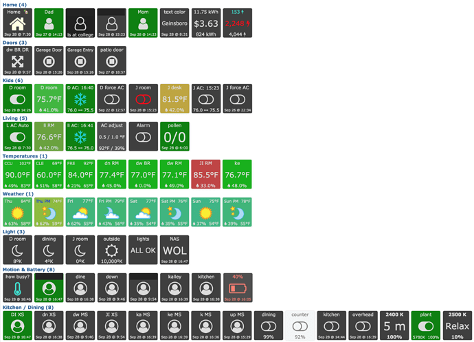
That should have been obvious even before I tried it. Fortunately it took me only a moment after I posted to figure that out. But then it took me a couple of minutes longer to realize I needed to change the tile size in categories. I’m clearly a little slow today. 
Share your Dashboard
I’m quite new to ST, decided to try it out a few weeks ago and did not care for it much in the beginning, UNTIL i found webCoRE  That was really what sold me… Anyhow here’s my first attempt with pistons. I’m trying to keep them organized by splitting them up in Automations, Routines and Scenes. I love being able to invoke the same scene in many different ways, everything from presence, harmony remote, sunset or button clicks…
Thank so much for all the work that’s going into this, both developer work and all the contribution on the forum.
i am still working through cleaning up everything and stop using the text style dashboard. i want to be able to see anything that i want to know with a single glance at the browser dashboard tab. and eventually have a version of that on a permanently placed ipad in the kitchen or something. that’s what started the evolution to this version of the dashboard. it would help get this done faster if i didnt keep going back to the old stuff and redoing them in a new way every so often. :-/
@bangali would you mind sharing your “Temperature” piston?
Seeing it on your dashboard, I like it, can i try yours instead of starting from scratch?
Temperature tiles piston
sure, happy to but have to clean it up to be a standalone. like it uses a global variable set by another piston to mute the colors display accordingly to the time of day. didnt want a row of bright green icons staring back at me when its 11pm at night. there are a couple of other things like that in that piston. i will cleanup and post as an example.
Could someone show an example piston with the gauges? Like @Nezmo Clothes Washer?
Also, how do you add the colored icons on the tiles? I have seen how they work with the icons from http://fontawesome.io/icons/ but am curious how to add those colored/animated ones.
You should be able to import the piston I posted here Share your Dashboard.
The colored icons are emojis. Be aware that emojis look different across platforms.
Thanks @Nezmo! I’ll definitely give that a shot.
I didn’t realize those were all emoji’s that seems easy enough!
Note, if your energy reporting device does not report voltage (I don’t think all do) you may have to make some minor changes for that.
Thanks! It seems to be working its not running at the moment so I’ll have to watch for them all to change.
Sorry, another question with the emoji’s, how do you format them in the in piston? The FA ones I currently have are {’:fa-bolt:’" On"}, how do you add an emoji instead of say the bolt i have? Sorry for the ignorant questions.
What platform are you using?
Mobile? Use the emoji keyboard
Windows? Use the on screen keyboard
Mac? I’m not familiar with that one.
I’d also like to use this if you don’t mind sharing. Even a version that’s not quite 100% would be very helpful. Thanks!
Im see the dashboard function, and trying to see how similar it is to this app below that was originally built by community members:
I am in no means advertising, just trying to understand what we get using the dashboard in this awesome WebCore tool?
Something similar is intended to be developed in the form of visors. You could have a very early look here : https://dev.webcore.co/visors
What you’re seeing above are tiles that can be customized a lot and can also be clicked. They are very useful and versatile. The only downside AFAIK is that since they were not built to be used as actionable tiles and all, they doesn’t refresh/react instantly. Someone with more tech knowledge could probably explain better than I do.
Note that my answer might not be complete since I never fully tried the product you referred to.
Does anybody (@Robin?) know if this visors dashboard is something that is still planned to be further developed? I use ActionTiles right now, but I’m getting frustrated with the locked-down customizability recently, and it seems that the webCoRE dashboard has more potential for customization?


