Gauge using more than 3 colors


#1

1) Give a description of the problem
I would like to use more than 3 colors in my gauge, but all my search in our forums has only shown me 3 colors (plus white if a section is left blank).

temp

2) What is the expected behavior?
Is there any way to add a couple of colors to the gauge?

3) What is happening/not happening?
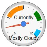
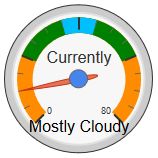
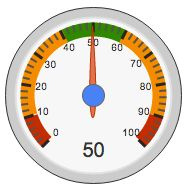
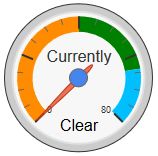
Here is my current code:

[chart-gauge min=0 max=80
greenFrom=0 greenTo=40 greenColor=DarkOrange
yellowFrom=40 yellowTo=64 yellowColor=Green
redFrom=64 redTo=80 redColor=DeepSkyBlue
minorTicks=4|Currently]

but even with me experimenting, I could not get another color to show.
Can anyone please tell me how to get more colors into my gauge?


Gauge colors not showing
#2

You can only have a maximum of three colors. The gauge on the webCoRE dashboard uses the Google Charts Gauge so you can only use the options that are available there.


#3

Dang, I was afraid you’d say something like that.
As a workaround, has anyone tested splitting up each color into two sections?

My attempt failed:
[chart-gauge min=0 max=80
greenFrom=0 greenTo=19 greenColor=DarkOrange
greenFrom=21 greenTo=39 greenColor=DarkOrange
yellowFrom=41 yellowTo=51 yellowColor=Green
yellowFrom=53 yellowTo=63 yellowColor=Green
redFrom=65 redTo=71 redColor=DeepSkyBlue
redFrom=73 redTo=80 redColor=DeepSkyBlue
minorTicks=4|Currently]

temp

It ignored the first command it seems.

If I cannot make more than 3 colors, then basically I need to split up the colors into 5-6 sections. Any ideas?


#4

I have seen Google gauges split 3 colors into multiple sections:
gauge

and I have seen up to 5 colors in use:
gauge

but cannot find the code to implement this myself.


#5

Well, a bit more experimenting has revealed something interesting…
Each line overwrites the previous line, so this command:

[chart-gauge min=0 max=80
greenFrom=0 greenTo=80 greenColor=DarkOrange
yellowFrom=20 yellowTo=60 yellowColor=Green
redFrom=35 redTo=45 redColor=DeepSkyBlue
minorTicks=4|Currently]

Yields this gauge:

temp

Not a very good solution for my dilemma, but maybe it will help someone.
I’d still love to know how the pics in my previous post got 5 colors in there though!

I wonder if it is possible to put in a semi-transparent color… It would essentially, create “new” colors where they overlap… Can anyone offer any guidance on this workaround?

Edit
For the really observant, notice how the small tick marks get progressively harder to see, the more colors layered there.


Air Quality and Pollen Gauges
Gauge Tiles & Piston State Display for Energy Reporting Devices
#6

how can you make tick marks show like image
thanks


#7

@beau76 Read this:
https://developers.google.com/chart/interactive/docs/gallery/gauge
It’s been posted before above, but you need to read it.


#8

hi @slam525i what i look for was a way to do more tick makes and have is show more numbers

but it did not get me the look of image above


#9

To create this gauge:

temp

I used this code:

[chart-gauge min=1 max=365 greenFrom=79 greenTo=172 greenColor=Green yellowFrom=172 yellowTo=265 yellowColor=DarkOrange redFrom=265 redTo=355 redColor=Sienna minorTicks=4 majorTicks=JFMAMJJASOND.|{season}]

If anyone knows how to do double digits for majorTicks, please share with us…